Brand Identity & Web Presence
The Challenge
Leslie was launching a consulting practice from scratch — a complete pivot from her prior coaching business. She had a clear sense of her values and the kind of work she wanted to do, but her existing brand didn’t reflect the professional, executive-facing practice she was building. She needed an identity that could carry the depth and warmth of her approach while showing up credibly in front of senior leaders and nonprofit organizations.
The Process
Before any visual work began, I developed a discovery questionnaire to understand not just aesthetic preferences but the emotional experience Leslie wanted her brand to create: how she wanted clients to feel when they encountered her work, what values needed to come through, and what she wanted to leave behind from her prior identity.
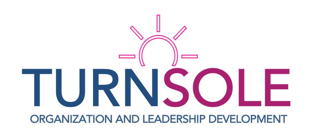
From that foundation I synthesized her positioning, values, and existing language into a brand platform. The name Turnsole, rooted in the metaphor of a plant that instinctively turns toward light, became the strategic anchor for every design decision that followed.
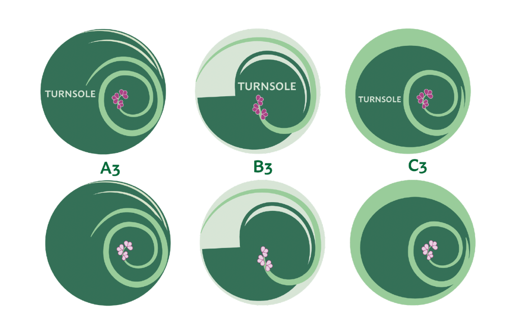
I developed three distinct logo concepts, each translating a different facet of that identity into visual form, with written rationale explaining the thinking behind each direction. After concept selection we moved into colorway exploration, testing multiple palette directions before refining into a final system.
The Work
Logo system and brand identity, color palette and typography, usage guidelines, five-page website, PowerPoint template, and proposal template.
The Outcome
A complete brand system that launched alongside Leslie’s new practice, giving her the visual credibility to show up confidently in front of the clients she was building toward.