Brand Identity Development
The Situation
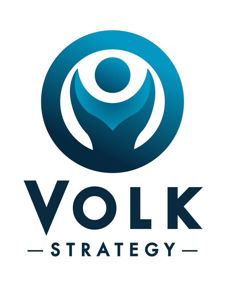
Volk Strategy relied on an AI-generated logo that was functional, but not quite landing with the credibility a strategy consultancy needs. The mark itself had potential, but the execution was soft: inconsistent typography, gradient-heavy rendering, and a lack of the visual confidence that executive-facing work requires. The goal was to refine what existed rather than start over, preserving the core identity while sharpening everything around it.
The Process
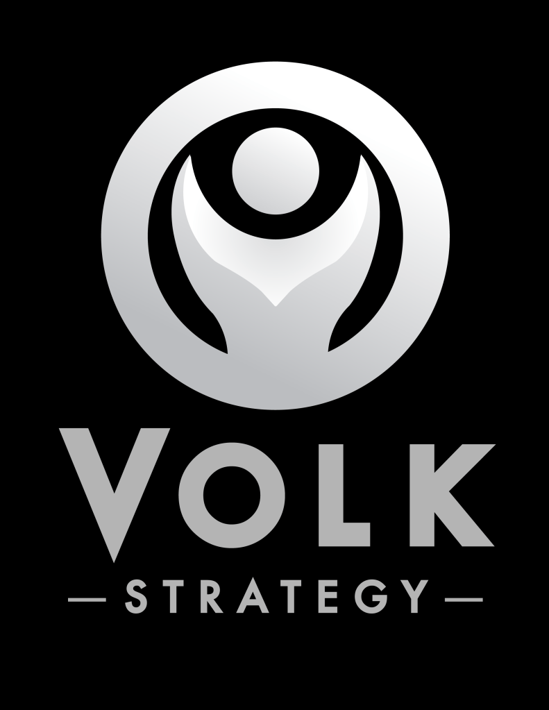
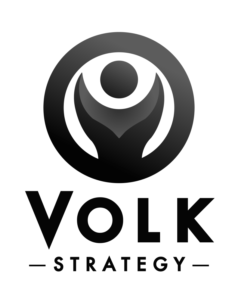
I began by refining the existing mark: resolving the typographic inconsistencies, tightening the letterforms, and rebuilding the icon with cleaner, more deliberate geometry. From there I developed a complete logo system including full color, single color, grayscale, and reversed variants, ensuring the identity could perform across every context a consulting practice encounters.
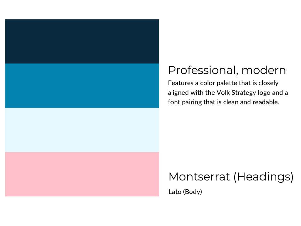
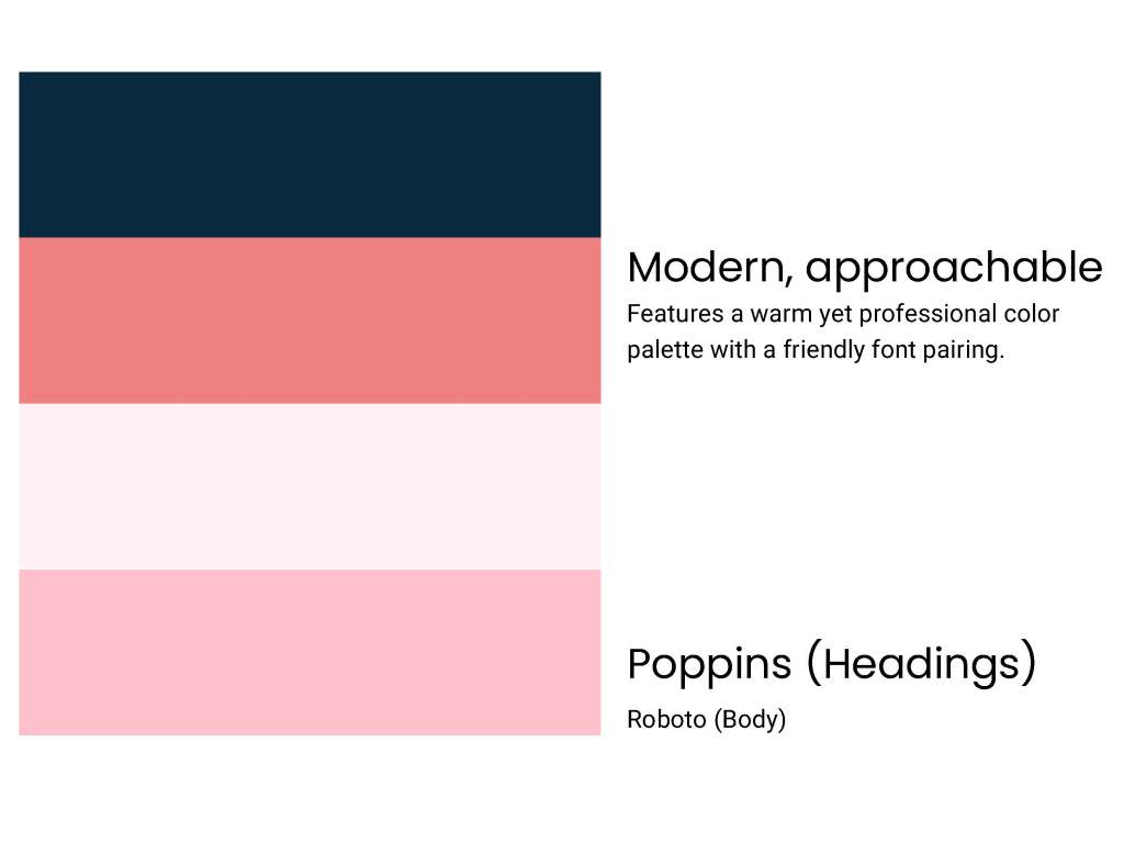
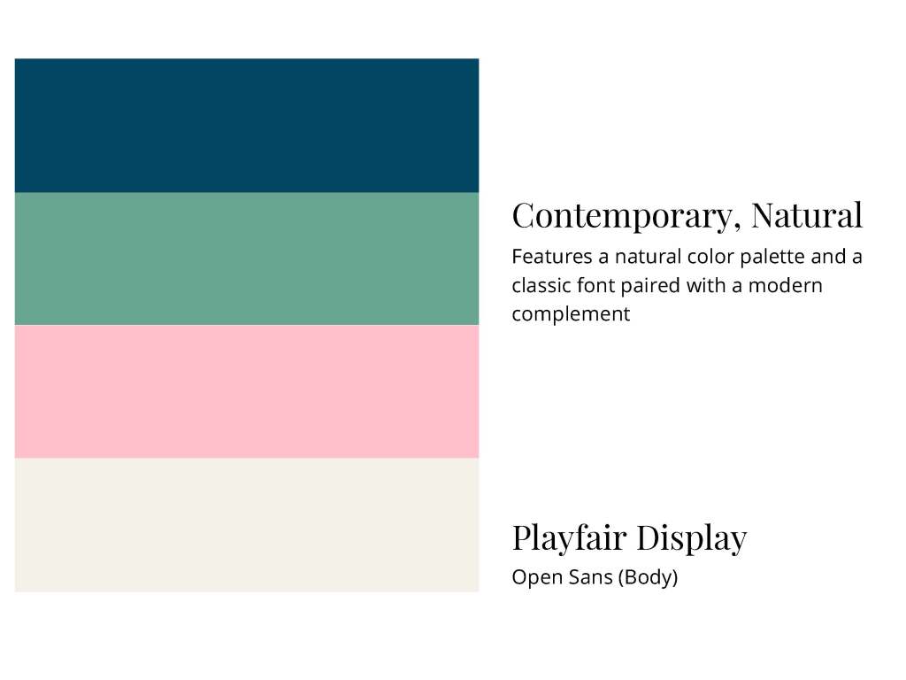
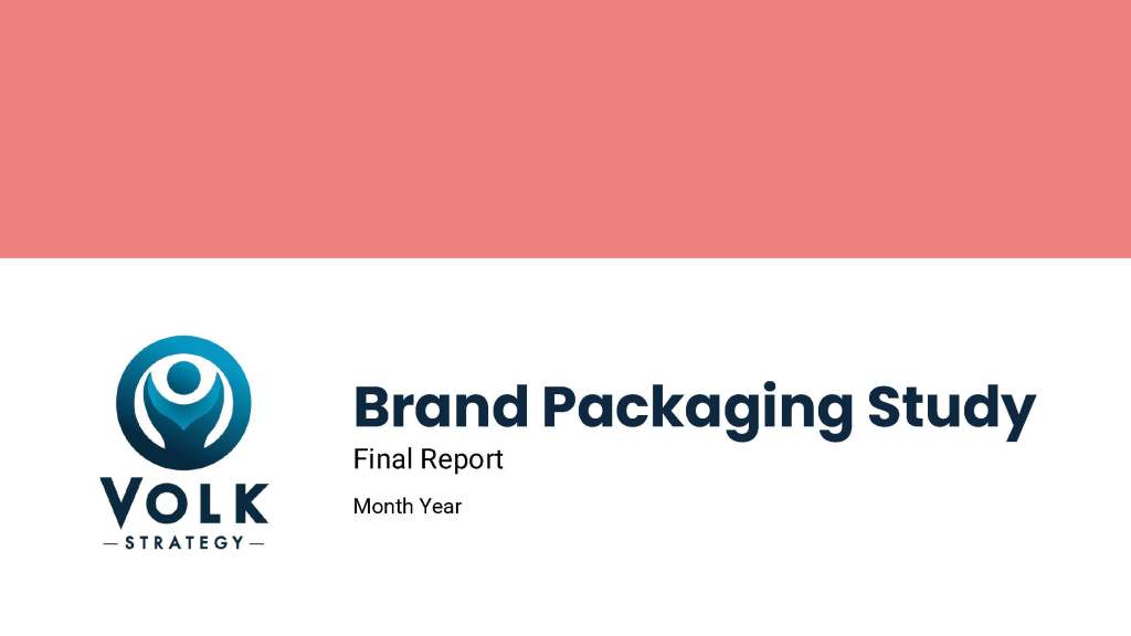
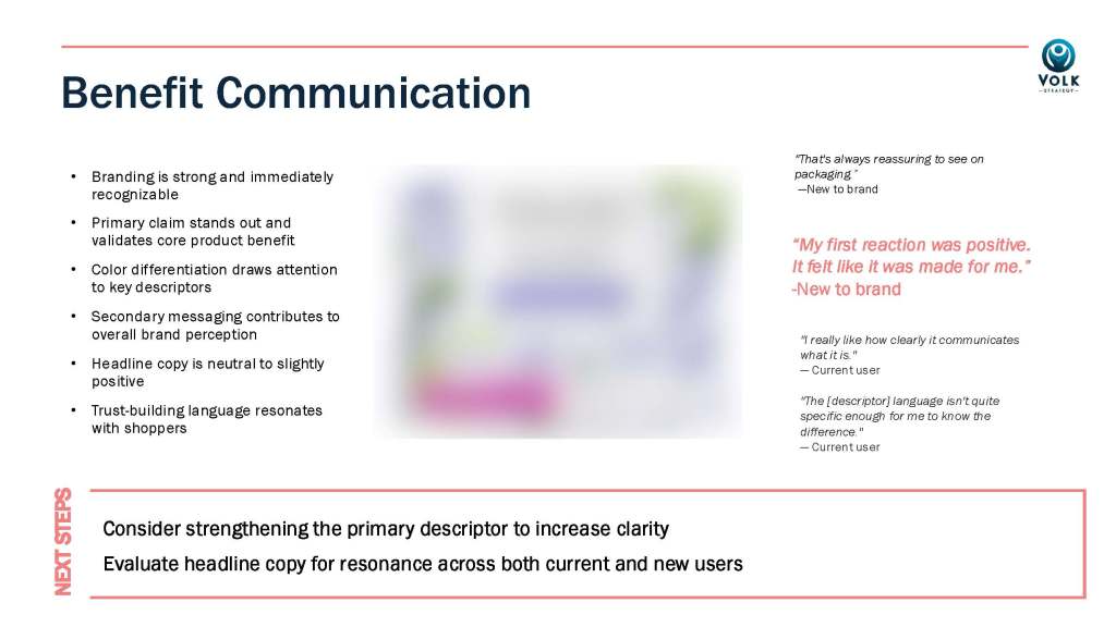
To extend the identity into a functional brand system, I developed three distinct palette and typography directions—each with a clear personality descriptor and rationale—giving the client a framework for choosing a direction that fit how she wanted to show up in the market. I then built a PowerPoint presentation template that put the brand system to work in the context her clients would actually see it.
The Work
Refined logo system with full variant set, three palette and typography directions, and branded PowerPoint presentation template.
Status
This project is ongoing though paused while the client navigates a personal matter, with plans to continue.
